skip to main |
skip to sidebar
Three bugs up my butt

- The word "explicate". God, but that is ugly. It invokes someone getting sputum on the muffin I am about to buy. I am not even going to honor it by investigating its etymology, but I take it that it is a vile back-formation from "inexplicable". Because, you know, "explain" and "describe" and "analyse" or even, god help us, "deconstruct" didn't already cover the bases. You have to sound like sputum as well.
- Shrinkwrap. Incredibly environmentally unfriendly, and I cannot get that shit open. Like, ever. Morally inexcusable, and makes me look stupid. What's to like?
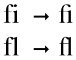
- Fonts with amazingly ugly ligatures. For the past eight weeks I have had to read a section of this otherwise perfectly respectable, if rather patchy, anthology of debates. The font in this book (10 on 12.5 Rotis Serif), an otherwise pleasant and readable type, has the most spectacularly vile "fi" ligature I've ever seen. As the wiki article helpfully notes, the point of the "fi" ligature is that the dot on the i interferes with the descending loop of the f and so the ligature absorbs the dot into the descending serif of the f, and the eye sees both the loop and the dot, although actually they are the same. The loop of the Rotis Serif f, however, does
 not extend as far to the right of the letter as in many other typefaces (technically, the x-width of Rotis is narrow). This means that when you delete the dot off the i in "fi" (and just for kicks, this book is in epistemology so the most usual and indeed ubiquitous instance of it is in "justified"), the loop of the f doesn't even approach the point at which you expect to see the dot. Every time the ligature appears is a smack in the eye. The automatic activity of reading, until that moment completely transparent to you, screeches to a halt as your neurons scream Alert! Bad command or filename. Abort, retry? and you blink as if a flash photograph got taken and there are purple afterimages dancing on your retinas.
Linotype claims that this face has "become something of a European zeitgeist". The .pdf sample page, which you can have a look at before you hand over your 25 euros for the privilege of hurting someone's eyes, contains not a single fi. Now there's an issue for consumer affairs ...

 not extend as far to the right of the letter as in many other typefaces (technically, the x-width of Rotis is narrow). This means that when you delete the dot off the i in "fi" (and just for kicks, this book is in epistemology so the most usual and indeed ubiquitous instance of it is in "justified"), the loop of the f doesn't even approach the point at which you expect to see the dot. Every time the ligature appears is a smack in the eye. The automatic activity of reading, until that moment completely transparent to you, screeches to a halt as your neurons scream Alert! Bad command or filename. Abort, retry? and you blink as if a flash photograph got taken and there are purple afterimages dancing on your retinas.


No comments:
Post a Comment